Keys to an effective QR code - part 1: from medium to scan
QR codes are everywhere, but are they really effective? Too often used as a simple technical redirect, they miss their true potential. When properly designed, a QR code becomes a powerful driver of engagement.
QR codes have become part of everyday life. On packaging, posters, printed materials, or at the point of sale, they are everywhere. Yet not all QR codes are created equal.
Between the ones that generate engagement and the ones that are never scanned, the difference does not come from the technology itself, but from how they are designed, integrated, and activated.
This article gives you practical, actionable keys to designing QR codes that are genuinely effective, useful for users, and high-performing for your communication campaigns.
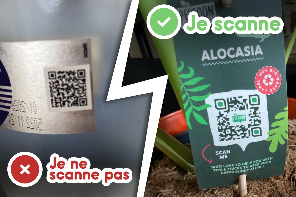
Not all QR codes are effective
A QR code is neither a gimmick nor a simple technical bridge. It is a strategic touchpoint between a physical medium and a digital experience.
When a QR code fails, the causes are almost always the same:
- a QR code placed on the medium "by default,"
- no clear promise for the user,
- a landing page poorly adapted to mobile,
- no interaction offered.
By contrast, an effective QR code is designed as a true engagement lever: it captures attention, triggers the desire to scan, and immediately delivers value.
An effective QR code starts on the medium itself
Free up space to create impact
The first lever of effectiveness is visual. A QR code buried inside an overloaded medium has very little chance of being scanned.
Best practices:
- free up space around the QR code,
- reduce the volume of information to focus on the essentials,
- treat the QR code as a central element of the medium.
Fewer messages, but better structured, help focus attention on what matters most: the invitation to scan.
Work on the CTA (Call To Action)
A QR code without a CTA is a silent QR code.
The CTA is essential to make people want to scan and explain why it is worth doing.
An effective CTA is inseparable from the QR code. It must be clearly linked to the QR code visually and should never be pushed into a corner of the medium, isolated and without visual hierarchy. Its emphasis is essential to capture attention and guide the eye. Above all, the CTA copy must be explicit, engaging, and benefit-driven. It is not just about saying that people should scan, but about explaining what the user will really get. Discovering content, understanding information, gaining an advantage, joining an experience, or accessing exclusive content: the CTA must clearly announce the value delivered and reinforce the promise of the brand or the campaign.
Turning the scan into impact: the power of a dedicated interface
The scan is only the beginning. To turn the physical action into a memorable experience, the user should land on a dedicated page, designed exclusively for mobile rather than a standard site that is merely "responsive."
A 100% mobile-first experience
The landing page reached from a scan must be designed exclusively for mobile use. It must load quickly, display properly on every screen, and create no obstacles in the user journey. Elements that create friction, such as intrusive cookie pop-ups, oversized headers, or cluttered footers, directly harm the experience and reduce engagement. In a QR code context, every second counts: the smoother the access to the content, the more likely the user is to stay and interact.
The benefits of a dedicated approach: performance and usability
Relying on a lightweight structure ensures better navigation and immediate operational efficiency:
Technical performance and operational efficiency
Using a specific format removes the technical barriers that slow down engagement:
- Ultra-fast loading time: by loading fewer resources, the site appears instantly, even on limited mobile networks.
- Deployment and agility: its lightweight structure, often compatible with no-code tools, allows design and launch in just a few days.
- Maintenance and tracking: fewer pages means fewer bugs and much more precise analysis of user behavior.
- Optimized costs: production and design require fewer resources than a full website, maximizing your ROI.
Native usability and browsing comfort
The design is not a simple desktop adaptation, but an experience built for the user's hand:
- Thumb-friendly optimization: buttons and touch targets are sized for real one-handed use.
- Reduced cognitive friction: the user is not lost in complex menus; linear navigation reduces mistakes.
- Message prioritization: this format forces you to highlight only a few value propositions and simple, clear goals, which naturally increases conversion rates.
- Improved readability: visual hierarchy and short copy make the content immediately understandable.
Formats adapted to mobile usage
To maintain engagement, content must respect vertical reading habits: short videos (under 60 seconds), well-cropped images, and concise text designed for vertical consumption. The goal is simple: maximum readability for immediate understanding.
Read the next article: Keys to an Effective QR Code - Part 2: Maximising Conversion